HTML+CSS
[ HTML+CSS ] box-shadow, text-shadow
duqrlcks
2022. 6. 15. 05:17
반응형
1. box-shadow
/* 구문 */
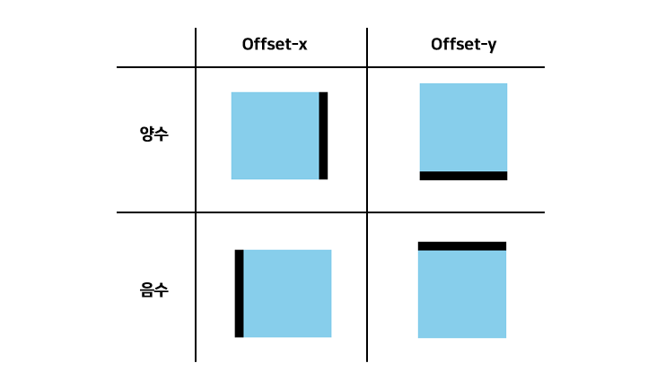
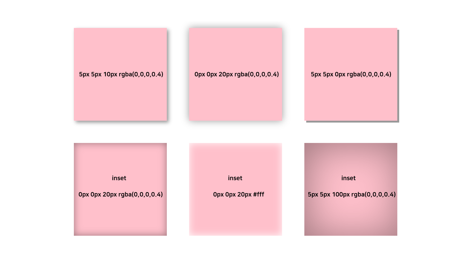
box-shadow: inset offset-x offest-y blur color
- offset-x: 수평 그림자의 offset값
- offset-y: 수직 그림자의 offset 값
- blur: 그림자 가장자리를 부드럽게 처리하는 정도 (default 0)
- color: 그림자 색 (default box color)
- inset: 안쪽 그림자 (optional)
💡 Tip1
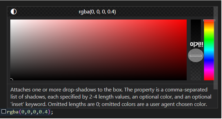
그림자 색깔이 연할수록 자연스럽다! vscode에서 색에 마우스 커서를 올리면 아래 그림처럼 뜨는데 표시한 막대를 아래쪽으로 당기면서 원하는 색을 정해보자.
💡 Tip2
그림자는 겹치게 생성할 수 있다. 콤마로 이어주면 된다.
See the Pen Untitled by 이찬 (@vexkruqa-the-typescripter) on CodePen.
2. text-shadow
/* 구문 */
text-shadow: offset-x offset-y blur color;
속성은 box-shadow와 동일하다. 차이점은 text-shadow에는 inset 효과가 없다.
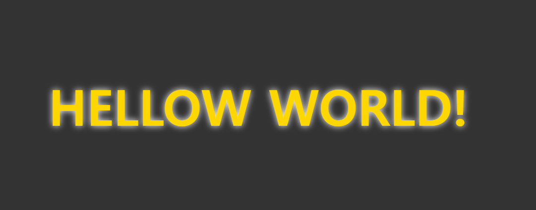
<style>
    body {
      background-color: #333;
    }

    h1 {
      font-size: 100px;
      color: gold;
      text-shadow: 0 0 14px #fff;
      margin: 200px;
    }
</style>

<body>
	<h1>HELLO WORLD!</h1>
</body>
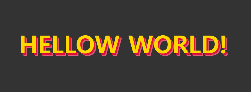
<style>
    body {
      background-color: #333;
    }

    h1 {
      font-size: 100px;
      color: gold;
      text-shadow:
        6px 6px 0px crimson,
        10px 10px 0px rgb(209, 93, 116);
      margin: 200px;
    }
</style>

<body>
  <h1>HELLOW WORLD!</h1>
</body>
반응형